
11-minute read
The Brief
Mike had always done steady business through his studio in the tourist town of Idyllwild, California, but between massive forest fires in 2019 and the pandemic in 2020, traffic and tourism to the town is way, way down.
We were brought in to update his website to attract more customers, as well as highlight his custom work.
My Role
On a team of two UX designers, I was responsible for interaction design, wireframes, visual design and UI, and prototyping.
I assisted my teammate in user reseach, usability studies, and brand development, and we collaborated closely on early sketches, early wireframes, and UX writing.
The Challenge
We started by assessing the site and brand. We combined what we learned with the brief, and three clear objectives emerged:
Modernize the site and branding with best-practice UX and contemporary visual design that still communicated the old-time vibe of Mountain Mike.
Draw more customers to custom orders and guide them through the process of placing an order for a custom-made product.
Sell “Mike”. He’s not just the business owner, he is the brand. We recognized a lot of value in the fact that he walks the walk, and wanted to invite people in to his story, to experience something more than just buying a thing.
“Mountain Mike” Allen is the real deal — he's been creating custom leather clothing and tools for living and surviving in the outdoors for over 30 years. But his website was failing to communicate his voice, story, expertise, or professionalism.
I go into more details on early brand development and overall strategy in this case study!
With branding and early research underway, it was time to get a clear picture of what we were working with. The existing website was terribly dated, with a confounding home page, rambling copy, confusing navigation, and a host of other usability issues.
The existing site:
The original home page — at least people genuinely like the photos!
A category page. Oof.
Product page for a custom-order item. All I know is that they’re $1,100. Or $1,400.
Psst! Like spoilers? Skip to the final designs!
Approaching the Problem
Heuristics
To establish a usability baseline, we evaluated the current website using the Nielsen Norman Group’s 10 heuristics. To dig deeper and reveal usability issues we hadn’t considered or yet noticed, we completed usability questionnaires from User Focus for several categories: Home Page, Navigation and IA, Writing & Content Quality, and Page Layout & Visual Design.
Using the NNG severity scale, 30% of usability issues were considered catastrophic. Yikes!
Exploratory Interviews
That was already a lot to work with, but we needed a user perspective baseline as well. We performed five interviews with users unfamiliar with Mountain Mike. We had them explore the mobile site, give overall impressions, and attempt to complete core tasks such order a custom-made item or tell us how to contact the business. I kept observational notes while my teammate Kiwani conducted the interviews, which we recorded both through audio and screen recordings.
Insights from these interviews:
It wasn’t clear to users that the business offered custom work — and in fact it wasn’t clear what the business did offer.
Users were unable to explain the custom order process, or how to place a custom order.
The language around “custom order” was going to be a challenge. Some users used the words “custom” and “customizable” interchangeably, and general usage of these terms was inconsistent across the board.
“I don’t understand what the products are.”
“What service he offers doesn’t make sense. Initially I’m not even sure if I can order online.”
Sketching and Early Wireframes
The site needed a lot: clear navigation, a usable layout, page goals, and consistent branding. And if we were to draw more customers to custom orders, it needed to communicate that process in a way that was simple and engaging. We wanted this to be not just approachable, but special. A collaboration between artist and client.
As part of the overall site redesign, we created a page that guided customers through the process of placing an order for a custom-made product.
From the start we envisioned this page as being step-by-step, with a mix of text and visuals. Here are some of my sketches exploring this idea:
I then took ideas to digital wireframes and continued iterating. Shown are wireframes exploring two different concepts for the page.
This is the initial wireframe we moved forward with, though before the first usability test I changed the gallery behavior away from the expand/collapse model.
We liked this animated reveal as a user scrolled down, but knowing we wouldn’t have extensive dev options it was scrapped for something simpler. It also didn’t allow for any product photos, which became integral to the idea of “get inspired” that became Step One.
Testing the Design
Round 1: low-fidelity
After initial brainstorming, we focused on mobile and I created a lo-fi prototype for our first usability test. Between Covid and budget constraints, we were limited to convenience sampling with neighbors in the backyard (luckily it was summer!). In another situation we might have tested our perfect target audience, but as we were looking for high-level feedback from a variety of people and age groups, it worked out great.
We had 4 participants, and recorded overall video as well as the mobile screen.
What we discovered:
The basic step-by-step page flow was clear.
An important step in placing an order for a custom-made item is a video consultation with Mike, where he and the client discuss and finalize the design. Users were intimidated by this video chat and wanted more information before committing.
Some information was difficult to find. For example. 0 out of 4 users could find information on how long a custom order took to make.
Language: As we saw in our early interviews, users were confused at the differences between “custom”, “customizable”, and “made to order”. We would need to continue clarifying these terms, and consider how we used them across the site.
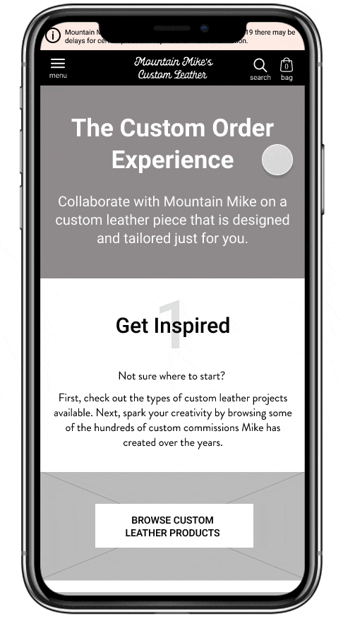
The Custom Experience page from our first usability test
Changes based on this feedback:
Progressive disclosure to prevent overwhelm: Customers considering a custom order need to feel confident and prepared before the video chat, but others are just browsing and too much detail could turn them off. To please both groups, I considered when and where most users were likely to need a certain level of detail, and offered some information by request (via links or basic modals).
“It’s kind of a high hurdle for me, at this stage. I’m not even sure if I want this yet, I’m just browsing - I want to know what are his things, his price range, etc. before taking the next step of the video chat.”
“As much as you can convey before the video chat I think is helpful.”
Shown:
The design used for our first test relied entirely on the copy on this page to convey a lot of information.
Prototype 2’s copy is greatly simplified. A user preparing to place a custom order can learn more by clicking the link to the FAQ. This new copy also helps answer a question from users — “what does custom mean?”
Prototype 1
Prototype 2
As far as finding information on custom order timline, I had two options: include even more information on the custom page, which many users still may not read. Second option: reconsider what info they really needed at this stage.
Option two led me to realize that since lead times can vary significantly between products, giving a broad generalization isn’t actually that useful to anyone browsing or getting the lay of the land.
Shown:
Timeline info buried in the last step
Info moved up the page into step 2. I also rewrote this step to be a friendlier and more concise intro to a video chat.
Prototype 1
Prototype 2
Another change based on our first test was to simplify product labels to reduce product confusion. First, we removed the color-coded badges from product images. Users liked the look, but they were confused as to how they differed.
We also removed the "made to order" designation entirely, as users didn't find the call-out for those products necessary, and it was easily confused with "custom order".
“Not sure what the difference between one of a kind and custom is, and made to order might be a similar thing.”
“I still don’t know what custom order versus made to order means.”
Shown:
The first version with it’s cute but confusing color-coded badges.
After our first test, we removed the badges entirely, as well as “made to order” from everyone except individual product pages.
Prototype 1
Badges removed after the first test
Round 2: adding visual design
From our early work on brand development, I chose a color scheme and font pairing for the site.
My goal for the visual style was to retain the strong voice and influences of the brand — the Old West, the California mountains, natural phenomena — but make it feel fresh: the genuine vintage article in 2021.

It was also important to use photos of Mike whenever we could. We learned in early user interviews as well as usability tests that visitors were intrigued by Mike and wanted to know what he was about.
I also included photos of California landscapes and specifically Idyllwild, California (where the shop is located) to reinforce that sense of place.
“If I can get a sense of the person, place, and the stuff that they’re doing, that’s gonna cause me to spend some money.”
“The photos are beautiful, it’s kinda captivating.”
One last note — the logo used in our design is a placeholder, with a logo design is planned for the near future.
Round 2: high-fidelity
For our second of two tests, I created a high-fidelity prototype while my teammate designed and lead the test. She had users explore the custom experience page, and also asked open-ended questions about branding so we could gauge if my visual design was successful.
What we discovered:
The visual design successfully and accurately communicated the product and brand story, and in general seemed to connect with users in just the way I was hoping.
Compared to our first test, users were much more comfortable scheduling a video chat.
The amount of information on the custom process page was just about right, as was the flow between custom item product pages and the custom experience page. Users were able to find almost everything with ease.
The exception: users in this round were also unable to find timeline information.

The Custom Experience page from our second usability test
“This seems like a small company, not a chain or something. This is a guy makin’ stuff. A genuine artist and craftsman.”
“I like the photos, the filters give a handmade feel. And the font — it reminds me of the lettering on old vinyl records. Like an old Creedence album. It matches the feel of the site.”
”
Changes based on this feedback:
Regarding the timeline info: users in both tests universally scanned the custom experience page instead of carefully reading, causing them to miss any mention of timeline, whether verbose or more concise.
This made sense — the page is, after all, meant to be a general overview, and I’d already recognized that a broad timeline that covered all products wasn’t that helpful. But where should the info go? I left the custom experience page as-is and added detailed timeline info to each product page where it would be specific and relevant to both the product itself, and the user at the stage of their research where they were considering a specific custom item.
This led my teammate and I to focus on a section of the product page that we’d ignored until then, and I’m really proud of my design for this block. It stands out on the page and the somewhat dry information easier to find and digest (the entire page can be seen below under “Final Designs”).
“I’d expect to find it in one of the bullet points here [on the product page], sort of an expectation of the time frame.”
Timeline info added to a custom item’s product page.
Final Designs
As this was a full redesign of the site, in addition to the custom experience page we also designed (for both mobile and desktop) a new home page, three types of product pages, category pages, a new FAQ, menus, and pages dedicated to Mike’s story and his studio in Idyllwild. I want to highlight a few screens in particular - scroll to see in their entirety.
The Custom Experience Page
This was the first new page we planned early in the project, so there’s no true before-and-after. What I’ve shown to compare is a product page for a custom item.
The old site: You’re greeted with a wall of rambling text that is inaccessible to new customers, and doesn’t provide context or expectations for how to place a custom order.
The new design: the Custom Experience page guides the customer through the process in a way that is friendly, simple, and approachable. More detailed information is available via simple modals or links to the new FAQ. The process flows naturally, and according to our testing it sets expectations well and is pleasing and un-intimidating.


Home Page
The old site: no clear page goal, no CTA, and no indication that it was a store that sold things. Users were intrigued by the client/artist and the photos.
The new design: instantly communicates the product and provides clear CTAs.
The visual design is evocative and accurate to the brand story.
By placing the documentary thumbnail above the fold, Mike himself remains a secondary focus on the home page.

Category Page
The old site: This almost felt like cheating because there’s nothing there! But clearly there was a need for a usable, informative, and engaging category page.
The new design: My version showcases product categories and provides multiple options to search or browse.
I included added full-width features to break up category pages with interesting articles, buying guides, or info about products.
It was important to provide multiple ways to navigate this page, for both users on a mission and those who want to browse and explore.


“About Mountain Mike” Page
One design I’m especially proud of is the About page. It was more of an artistic exercise than the rest of the site.
I saw an opportunity to tell his story in an evocative, cinematic way that also highlighted the core principles of his company.

Conclusion
This was a large project that encompassed the full range of my UX skills. I was thankful to have the opportunity to see a project through from strategy and generative research, to wireframes and usability testing, to visual design.
People often think that we’ve figured out ecommerce, and there is definitely a lot of data about what works and what doesn’t. But there can be unique challenges hidden in problem spaces that appear mundane, and always something new to learn from users.
Something I learned for projects like this in the future is to make sure development resources are lined up ahead of time. Because that wasn’t done here, some design decisions were based on our best estimation of hypothetical technical constraints. I researched ecommerce platforms to make those estimations more realistic, but having concrete boundaries would have been ideal!
Tracking Success
Once the site is live, my teammate and I will track key analytics data and KPIs, especially around custom product engagement/conversions and user behavior on the new Custom Experience page. From there, we plan a round of tweaks to the design, if necessary, that reflect the way customers use the live site.
Thanks for reading!
go back to Gates Foundation Discovery Center
continue on to Stradella Accordions