
9-minute read
Defining and Refining a Branded Experience
User Research, Website Heuristics, Brand Development
Challenge
Mountain Mike’s Custom Leather is a small business based in the mountain hamlet of Idyllwild, California. Historically, Mountain Mike has gotten plenty of business through his retail location in Idyllwild. But in 2018, forest fires devastated the area and cut off almost all tourism to the town. The client must now rely on his online presence, and traffic to the site is almost nonexistent. He specifically wants to highlight his custom work, but what little business he gets through the website is for pre-made items. Our research makes clear that the site design (or lack thereof) greatly hinders users and makes ordering custom pieces an act of pure guesswork.
After talking to the client, exploring the space, and digging into the website, it was obvious that more could be done than some SEO and a simple facelift. Mountain Mike’s has a strong identity and unique user base – both things that could be leveraged alongside a modern, more usable website to rebuild the business.
Target Users
No matter their specific interests, Mountain Mike’s customers come to him for unique, traditionally made goods of very high quality. The client’s current customers are happy to invest in heirloom leather items made by a real “mountain man”.
User subgroups include:
Western-wear enthusiasts
Film and television productions
Historical re-enactors
Harley Davidson riders
Survivalists
Constraints
Time: Our team of two had only 3 weeks, concurrent with other projects, to finish research and brand development in preparation for a website redesign.
Remote client: The client is in another state, and is not tech-savvy. Communication required flexibility.
Budget: Options like professional product photography weren’t possible, so visual design needed to be especially creative to make the most of few resources.
Role & Team
Team of two designers, with most work done collaboratively.
Approaching the Challenge
User Impact
Users seeking Mountain Mike’s work are hindered by a confusing website and custom order process. In generative interviews, users weren’t even sure it was a retail site.
“What is the site about? I don’t understand what the products are.”
An instantly readable home page with effective branding could instantly tell a user “this is what you’re looking for”. A well-designed and tested site could then provide a satisfying, engaging, and streamlined buying process. And tying it all together with a cohesive story about Mountain Mike, who essentially is the brand, will leave customers not just with a product, but a personal, compelling connection and story of their own.
Business Impact
The business impact is clear: with effective content strategy and SEO, Mountain Mike could reach a much larger pool of potential customers. With a well-designed and well-tested website, he could turn them into customers for life. And with a clear, enticing process for customers to order custom goods from anywhere in the world, Mike will no longer need to rely solely on local traffic.
Defining the Challenge
It was easy to find design or usability problems with the website, but to create an overarching content strategy for Mountain Mike’s we needed to truly understand the whole picture. We began by discussing the problem statement, and I created a mind map while we answered key questions about the business and user needs, user groups, and what defined success.
The client has a large pool of potential customers seeking products that appeal to their unique aesthetic and desire for quality. But the website and branding stand in the way of connecting these customers to the business.
How might we…
help users fulfill their need for self-expression through high-quality, hand-crafted, custom leather goods?
Research to Determine Project Scope
Heuristics & Usability
To establish a usability baseline, we evaluated the current website using the Nielsen Norman Group’s 10 heuristics. To dig deeper and reveal usability issues we hadn’t considered or yet noticed, we completed usability questionnaires from User Focus for several categories: Home Page, Navigation and IA, Writing & Content Quality, and Page Layout & Visual Design.
The results weren’t very surprising, but let’s highlight a couple things:
Using the NNG severity scale, 30% of usability issues were considered catastrophic.
Navigation and IA were especially bad when put to a similar test: 47.5% of navigation-specific usability issues were considered a major issue.
A look at the NNG results - yikes.
While users aren’t outright prevented from getting anywhere on the current site, it’s probably not easy or pleasant.
For more spreadsheet goodness, see our complete heuristics data.
Interviews
To provide a comprehensive user view of the current website, we performed five interviews with users unfamiliar with the company. We had each participant explore the mobile site and attempt to complete certain tasks, such as find a way to contact the business or order a custom leather item. I made audio recordings of each session and kept observational notes while my teammate Kiwani conducted the interviews.
Afterwards, we affinity diagrammed the interview data to pull out themes and identify key issues.
Affinity Diagramming & Interview Findings
Kiwani and I diagramming like pros
…and like the nerds we are.
Key Findings
Affinity diagramming led us to separate usability issues into three broad categories: IxD & IA, Brand, and Products (which comprised of custom ordering-specific issues as well as product page and product-specific issues).
Overall, users were very confused by the home page. They found it very unclear what the site was about, what the products were, and how to find them. And while most were intrigued by Mike’s story, they felt it was far too prominent on the home page.
“I like the pics but they take up too much space.” -P1
“The video tour should be him talking about his products.” P4
Branding and lack of product prominence was a huge issue for all users. The lack of products on the home page led some to even question the purpose of the site.
“I’m not even sure I can order online.” -P3
“It doesn’t say he does custom leather. I’m not sure what he does.” -P5
Navigation didn’t fare much better: users struggled to find search, shopping cart, and even the hamburger menu. They also had trouble finding contact information, and wanted to click on the static phone number on the business card image in the header.
“I’m used to seeing the hamburger in the corner, I didn’t see it in the middle.” -P5
As far as ordering custom leather, users agreed that the process wasn’t explained in nearly enough detail. And even the wording wasn’t ideal - several users were confused by what “custom leather” actually meant - fully custom from the ground-up, or “customized”?
“I don’t know what to include in the custom leather form. My hip measurement? Color?” -P2
“Custom ordering definitely needs more information about the process.” -P3
Proposed Solution
Content Strategy
The client has a very specific aesthetic and strong identity. But a lack of content strategy means that his story and passion don’t translate to the website like they do in person. With a cohesive and thoughtful content and visual identity that stays true to his core brand values, I believe the client can create connections with new customers while affirming his relationship to current ones.
Our solution needs to take into account his very distinct identity and story as well as the usability needs of an ecommerce site.
The purpose of creating an overarching content strategy alongside a well-designed and tested website is to infuse Mountain Mike and the ‘mountain man’ identity throughout every aspect of a streamlined online shopping experience.
Brand Identity
To establish the client’s brand, we sat down and began building a brand identity based on the concepts of brand heart, brand messaging, and visual identity.
Brand heart (Purpose, Mission, Vision, Values)
Education
Quality
Honoring of the craft
Artisan
Handmade
Personal connection
Self-expression
Brand Messaging (Tone, Voice, Personality, Taglines, Value proposition, Messaging pillars)
Warm
Highest quality
Unique
American-made
Long-lasting
Sustainable
Traditional
Expertise
Visually Identity Logo, Typography, Color, Imagery)
Organic textures
Old-timey
Sepia
Turquoise, forest green, brown, ocher
Natural
Forests
Mountains
Mood Board
To begin establishing a visual language, my teammate gathered images, fonts, and colors that represented the brand identity. I then turned these elements into a mood board that itself reinforced the visual identity we were beginning to establish.
Next Steps
Before diving into a website redesign, we defined the challenges with current brand identity, we established a usability baseline for the current website, identified key website pain points, and created a brand identity and style guide.
Moving forward, we will:
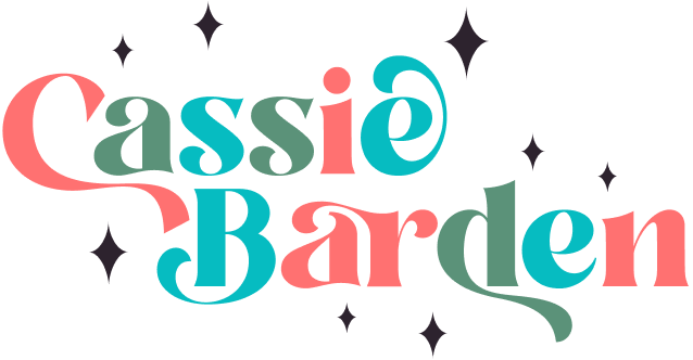
Continue building out the brand strategy, including a voice and tone guide for UX writing and redesigning the logo
Dig into IA, especially navigation, and perform tree tests to validate navigation changes
Do all the IxD! With a special focus on: hierarchy to prioritize custom goods, product page usability, and balancing the client’s story with retail needs
Design a clear custom goods ordering process
Run multiple rounds of usability tests
Finalize visual design
Thanks for reading!
go back to Stradella Accordions
continue on to Gates Foundation Discovery Center