
8-minute read
Overview
The Bill & Melinda Gates Foundation is a Seattle institution that funds a wide array of humanitarian projects around the world. The Discovery Center is a physical touchpoint for the community to connect with this work.
60,000 people visit the Discovery Center each year from around the world. And yet, this multi-million dollar celebration of the Gates’ humanitarian projects uses a pen and paper guestbook.
This severely limits the Center’s ability to track users, respond to feedback, or use comments for outreach or customer support.
Role
As part of a design team, I was responsible for:
User Flow, Interaction Design, Design Documentation, Client Liaison, Client Presentation

The Discovery Center’s low-tech guestbook...

...hidden near reception.
In addition, without digitized feedback Partners (the people and NGO’s who work with the Gates Foundation) have no reliable way to know the impact their work has on visitors.
The Discovery Center focuses on human connection. I saw the potential for this design to solve both the Center’s data gap as well as the connection gap between Partners and visitors.
Client Requirements
A solution that solved for both could get to the heart of the client’s asks:
Partners would have evidence of impact outside those who directly receive help from their work
Visitors could have more engagement and connection to Gates causes and initiatives
The Discovery Center could consistently and easily follow-up with visitors after they leave the museum
The Center would have searchable, actionable data about visitors: their passions, ideas, and experiences in the museum
All in a system that was engaging, accessible, followed data-handling best practices, and fit into the existing feel of the museum and its exhibits.
We also weren’t limited to a form factor or specific technology. The Discovery Center has a wide variety of digital experiences, and they asked us to think big.
Early Research
Auditing the System to Validate a Need
To validate the hypothesis that visitors and Partners lacked a way to connect, I performed a content audit on all current exhibits.
I confirmed that while visitors took advantage of many opportunities to share their thoughts with each other and in conversation with the museum itself, there was no way for visitors to connect with Partner people or organizations.

Interviewing visitors to gauge desirability to connect with Partners
We had an idea for an app that would allow visitors to send messages to Partners. The testing team performed casual visitor interviews to answer key questions:
Were visitors interested in the concept?
And would this add enough value to make them comfortable sharing their email for future outreach?
The results:
8 out of 10 rated their interest in sending a message to a Partner as 3 or higher (out of 5)
6 of those 8 were equally interested in giving their email for follow-up communication, such as a Gates newsletter or information about the Partner’s projects
“I’d be highly interested in [sending a message]. I think they’re doing really important work, so even if it was just encouraging words, I think that’s really good.”
With client requirements in hand and our hypothesis validated, I formulated a problem statement:
Problem Statement
How might we design a system that fuels Partners and connects Visitors to causes that mean the most to them, while solving for the Discovery Center’s data gap?
Mapping the User Flow
With our message concept taking shape it was time to dig into user flow and usability. In a collaborative whiteboarding session, we worked out the basic flow of the app and where to focus our testing efforts.
The testing team walked away with questions to explore, from what type of input users prefer to visitor mental models for the causes and exhibits.
Concurrently, I researched privacy ramifications of the design.
Solving a Privacy Puzzle
The Discovery Center hosts visitors from around the world as well as many student groups, so it was important to make sure our app was designed with data-handling best-practices baked in. I needed to answer:
How would data-handling requirements from the client impact the user flow and app design? How could kids use our message system without violating data-handling law?
I love digging into thorny technical challenges, so my team was more than happy to leave this to me. After diving into the EU’s GDPR law and best practices, I designed our user flow. I continued to iterate alongside the designer working on individual screens, determining how both the front- and backend of the app could properly handle data in an elegant way.
My final user flow documentation for sending a message to a Partner and submitting feedback to the Discovery Center. This includes backend behavior to process user data, including that of minors, following data and privacy law.
For a more in-depth answer to the Privacy Puzzle, my GDPR learnings, and the related design decisions effecting the user flow, head over here.
The Design Takes Shape
Learning and getting inspiration from competitors
Throughout the project I kept our client’s mandate to think big — and to avoid simply digitizing the guestbook — top of mind.
So for digital experience inspiration I visited Seattle’s Nordic History Museum and Microsoft’s Visitor Center.
Nordic History Museum, Seattle, Washington
A clever video wall at Microsoft, which effectively drew me in to read the story.

Microsoft Visitor’s Center, Seattle, Washington
Both Microsoft and the Nordic Museum used directional speakers, video, and motion to enhance the environment of the core app experience.
Our design was about engaging one-on-one and making the causes in the Discovery Center more personal. I saw an opportunity for motion, video, and audio to enhance the design and experience.
And in addition, these techniques could be tools for improved accessibility through audio descriptions, animated captions, and more.
Generative sketching: a scaled-up app experience
While we were designing an app, we were asked to think bigger than a tablet at the reception desk. The client wanted something that felt like it belonged alongside the existing, scaled-up digital experiences in the Discovery Center.
My goals for these sketches were to brainstorm:
How to quickly communicate the purpose of the design
How a user might browse recipients and choose who to send a message to
How they might input their message
How the design could pique visitor curiosity and match the feel of the rest of the museum
How we might use motion to strengthen the the user experience and usability of the app
Mid-Project Retrospective
We’d validated our concept and moved into early wireframes. But as screen designs emerged I worried our designs were diluted from what was possible, and more importantly, what the client envisioned.
While the concept and user flow were solid, early wireframes ignored the mandate to think big. The screens themselves were designed assuming a specific form factor which closed off many potential layouts, design patterns, and interaction concepts.

Early wireframes recognized the basic app flow but made assumptions about form factor and how a user might interact with the app.
I gathered everyone together and challenged the team to revisit a primary client goal - to create something engaging and ambitious.
What emerged after this conversation were ideas untethered to any specific form factor.

Wireframes exploring different ways users might interact with the app and understand its purpose
During this mid-point I also suspected that time pressure was a factor in diluting our concept. To address that, I injected some project management into the second half of our timeline, including an updated list of deliverables and remaining tasks.
As part of this effort I initiated inclusive conversations regarding the remaining work. As students, I knew everyone on the team had their own goals and aspirations. I didn’t want expediency to silence the diversity of perspectives and contributions on the team.
The results of this were positive: our design improved, our team regained cohesiveness, and our we realigned the design to the client’s needs. In addition, teammates were more empowered to take ownership of their parts of the project.
Testing the Design for Ease of Use
Usability testing round 1
Our testing team completed three rounds of user testing. The first round uncovered large issues around communicating the purpose of the design, email collection, and a lack of interactivity.
Welcome Screen
4 out of 6 participants found this screen confusing and didn’t immediately understand the purpose of the interactive.
Recipient selection
While overall this screen was much more clear, half the participants called out the quotes at the top.
“I kept going back to it trying to understand, but I didn’t get it.”
Email collection
Two participants didn’t like or didn’t understand the way the design asked for their email.
Lastly, half the participants wanted more interactivity and information about recipients. From this feedback I pushed us to use full-screen video that plays during the “passive” state. This design suggestion was added to the final design.
“The things I’ve noticed when walking around, the things I was more engaged with, were the things I could tap. If I could hear someone’s story and offer feedback in a more interactive way, that might be more engaging.”
Changes based on round 1
Results of rounds 2 & 3
The results of round 2 testing led to more subtle changes, like reducing taps and animations to clarify and simplify the flow.
Round three revealed that the while the message flow was clear and usable, participants had lingering confusion about the purpose of the interactive.
Proposed Solution
The visual designer finalized key screens, which I built out and used to create a prototype demo for the client.
I also considered context of use and incorporated app screens into a mockup of a physical interactive.
The final prototype demo I created for our client presentation.
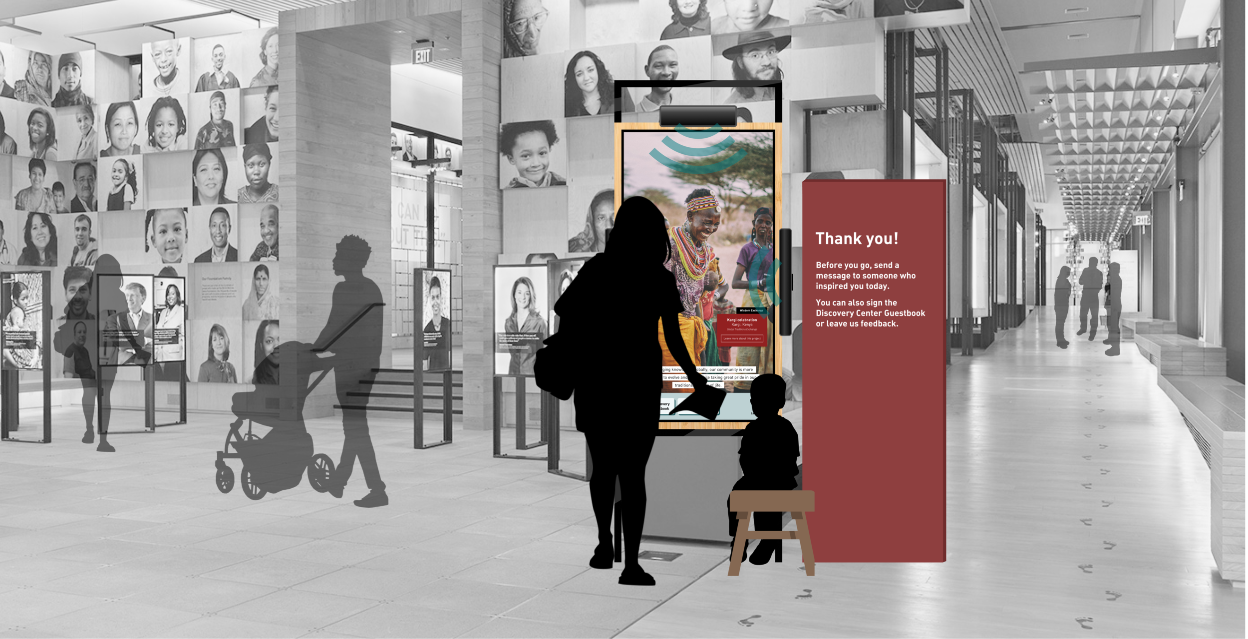
The design as it might look in the Discovery Center.
Documenting Interaction Design for Our Client
Once user testing and visual design on the message flow were complete, I took key screens and built out a second flow for giving feedback to the Discovery Center.
I also finalized modals and error states and determined the remaining interaction design, including micro-interactions.
Lastly, I annotated a complete set of animation and design documentation to hand off to the client. Head over here to see the complete set!
Conclusion
With more time…
There were a few key things I wished we’d had more time and resources for:
Testing the app with kids
Working with a developer to validate my “best guesses” about data handling
Designing more thoroughly for accessibility
Incorporating ideas for a more immersive experience
How I Pushed it Further
Directional Speakers: To enhance the digital experience, I added directional speakers. Full screen videos play with narration, but the sound won’t disturb others nearby.
I also added captions for increased accessibility.
Sign the Guestbook: Our team focused on sending a message to a Partner, and that flow remains the primary action for visitors. But a core client requirement was left behind - a digital guestbook.
So I added a direct way for visitors to sign the Discovery Center guestbook just as they do in the current notebook, but in a digital format that is searchable and actionable.
Look over here: Lastly, I made the overall design larger to more closely match the scale of current interactives in the Discovery Center and to better capture the attention of visitors.